With my order from LosBlock picked up a bunch of the city tiles. These things are so damn cool! But there’s a problem…
These things have a lot of detail on them and they cause some of the obsessive elements of my personality to rear up. Remember when I mentioned my desire to pump ‘visual interest’ (excessive detail) into what I’m working on? Yeah… Trigger’d

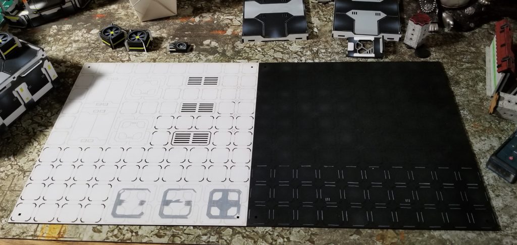
I’m trying pretty hard to restrain myself. I don’t want to go over the top and uber-paint these tiles. I’m trying to keep them clean. Here are the first 2 I started working on:

With this scheme I think a black/white or grey layout would look good. The white tile is the one that is really triggering my OCD. All those little check marks around the boxes demand to be painted! With some of these tiles that equates to 400 check marks each. Ugh!
The black tile is way easier to do, but is low in detail. I’m afraid I’m not taking advantage of all the cool bits etched into the sheet. Needs moar visual interest!!!!
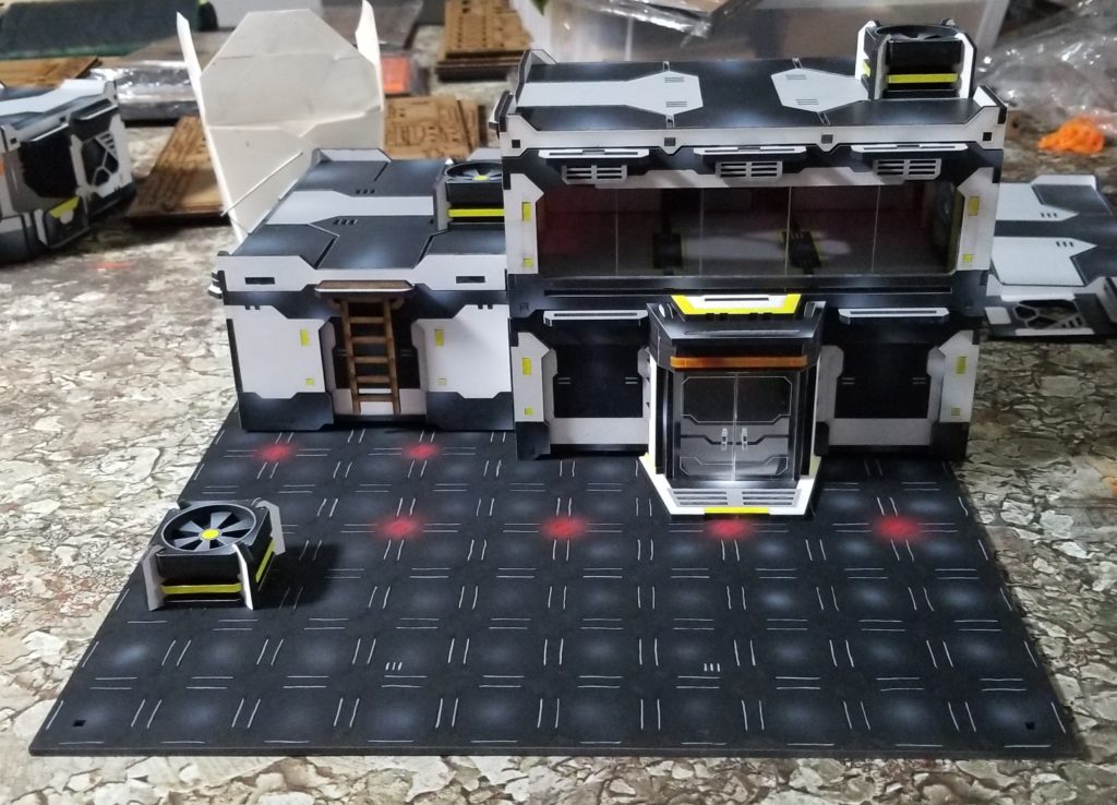
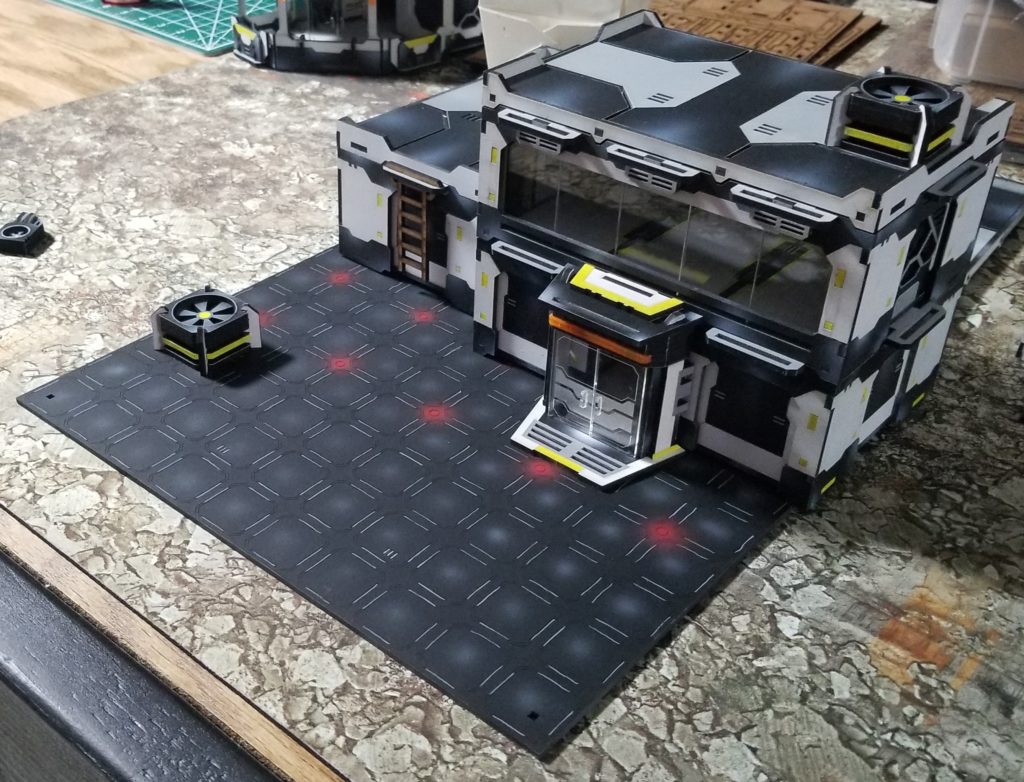
In the end I think I’m going to go with the black design. I like the red glowing lights and its minimal look. Here’s it finished with some terrain on top. I’ll have a better impression when I’ve finished 4+.
More to come as I progress.
Shawn G. (SoI)

